Insurance Home page Widget UX Redesign
Overview
An opportunity was identified to improve the discoverability and accessibility of the platform's two highest-priority actions Get a Quote and Make a Claim to reduce friction and create a more intuitive customer experience.
Industry
Insurance
Date
June - Aug 2025
My role
Concept initiative
Observation
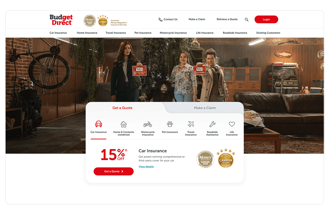
Excessive text and centre alignment reduce readability and scanning
Overuse of red creates visual fatigue and weakens hierarchy
Mobile layout struggles to present multiple insurance options within limited space


Raw Ideas and Design
This proposal design was developed using logical thinking and an understanding of natural user behaviour, in collaboration with the UX team. It was intended to present a new widget concept to the business for early validation before progressing into deeper UX research.


Whats improved?
Minimised usage of red colour
Reduced text and right aligned
Categorised insurance details
Minimised usage of red colour
Reduced text and right aligned
Categorised insurance details
Minimised usage of red colour
Reduced text and right aligned
Categorised insurance details
New space to display awards
Moved ‘Make a Claim’ to more accessible space for better navigation
New space to display awards
Moved ‘Make a Claim’ to more accessible space for better navigation